Themes
Introduction
The Payen Platform allows merchants to apply custom styling to match their brand. The idea behind the custom styling is to maintain a consistent look and feel between the merchant’s website and the Payen Platform.
- It is important to note that only basic styling of the Payen Platform is permitted.
- Basic styling is defined as changes to colours and logos.
- Structural modifications or repositioning of any other elements on the page are not permitted.
- Use the same logo as that appears on the merchant’s website
- Use the same base set of colours as used on the merchant’s website.
This guide specifies which elements of the Payen Platform may be styled and the exact ways in which they can be customised. Appendix A contains a table of all permissible values along with their default settings. To apply custom styling to the Payen Platform, this table must be completed and submitted to your integration manager.
The final styling document is created and maintained by Payen. Any updates to a merchant’s Payen Platform styling must be requested through your assigned integration manager.
Styling
Header
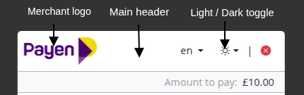
Merchants can provide a logo for the Payen Platform, with separate versions for the light and dark accessibility variant.
Merchant Logo
The merchant logo is displayed within the main header of the Payen Platform. When submitting styling details to the integration manager, logo image files must be provided for both light and dark themes. Providing separate logos for each theme ensures sufficient contrast and readability regardless of the user’s theme preference, helping the application meet accessibility standards.
Logos may be supplied at any size up to a maximum of 500px wide by 250px high. This size limit is enforced to ensure optimal performance, consistent rendering, and fast load times across devices. At runtime, the logo will be scaled proportionally and contained within a 235 × 47 pixel area to maintain a consistent layout within the header. The containment area has an aspect ratio of 5:1, and logos that closely match this ratio will produce the best visual results.
Main Header
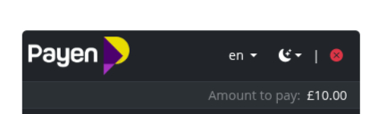
The background colour of the main header in the Payen Platform is not configurable by the merchant. The header will automatically display using either a light or dark variant, based on the end user’s preference, when the light/dark toggle is enabled.
The light/dark toggle visibility is configurable (on/off). If disabled, the Payen platform defaults to the light variant. However, merchants can set the dark variant as their default via the theme sheet (Appendix A).
The visibility of the language toggle is configurable (on/off), enabling merchants to control user language switching. If disabled, the language defaults to ‘en’ and the toggle does not show.
This behaviour is enforced to meet accessibility standards and to ensure the application remains compliant, providing appropriate contrast and readability for all users. As a result, the header appearance may vary depending on user settings or configured defaults, and cannot be explicitly controlled beyond the available configuration options.
Card Entry Screens
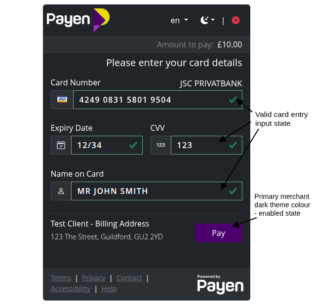
There are two types of the card payment screen, each displayed in light or dark variant based on the end user’s preference.
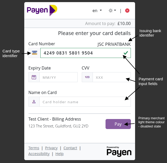
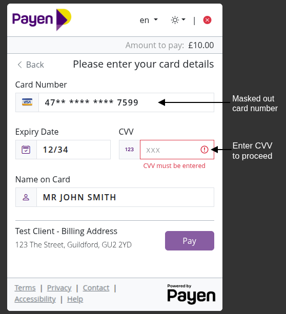
- The App View presents a traditional web form for card payments.
- The Web View provides an interactive, virtual card interface that visually replicates a physical card, giving users a more immersive experience. By default, the payment screen is set to the App View. To enable the Web View, please specify in Appendix A for your configuration manager to configure.
App Views
|
|
Web Views
 |  |
 |  |
The Web view for card entry has a default colour when no card details have been entered (red). Once the user has entered a valid card number the styling of the main card changes depending on the card type, these styles are not configurable. When the card had been chosen it should be noted that parts of the card will differ in shade due to our overlay (as seen in the image above).
In both the app and web card views, the only customisable elements are the primary and secondary button colours. Merchants must specify these colours for both light and dark themes in Appendix A.
The Web View uses chevron-shaped buttons, while the App View uses standard rectangular buttons. This styling is applied consistently throughout the remainder of the transaction according to the configured view.
The colours may be the same across light and dark variants; however, they should be chosen to ensure:
- sufficient contrast, and
- compliance with accessibility standards.
Card Payment Button Label
The payment button displayed within the Payen Platform can be configured to show a custom label to better align with the merchant’s use case or user experience requirements.
When this configuration is enabled, the button text can be set to either 'Pay' or 'Deposit', depending on the nature of the transaction flow.
Merchants may choose to:
- Display the button label as 'Pay', indicating a standard payment transaction, or
- Display the button label as 'Deposit', indicating funds being added or held within an account context.
If no configuration is provided, the button label will default to 'Pay'. This behaviour is controlled at the account level and must be specified in Appendix A for configuration by the integration manager.
Default Name on Card
The Name on Card field can be configured to be pre-populated with a default value. When this configuration is enabled, the Payen Platform will automatically populate the Name on Card field with a predefined value associated with the merchant account. This helps streamline the payment process by reducing the amount of manual input required from the user.
Merchants may choose to:
- Provide a static default name to be displayed in the field, or
- Leave the field empty, requiring the user to enter the name manually
This behaviour is controlled at the account level and must be specified in Appendix A for configuration by the integration manager. The pre-populated value remains editable, allowing users to modify the name if necessary before completing the transaction.
Card selection
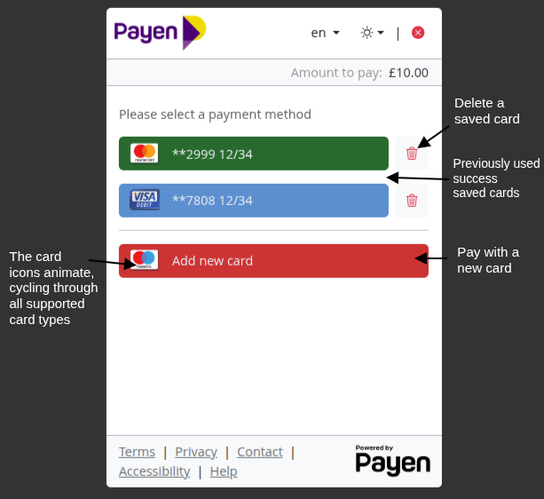
When a user has saved cards on their account, they can enter a new card by selecting the Card button, which is displayed beneath any previously saved cards. By default, this button uses the same colour as the physical card appearance shown when entering card details in the Web view for card entry (red).
 |  |
Any previously saved cards are coloured according to their card type. In the Web view for card entry, this styling is carried through to match the visual card displayed.
Unlike the Web view, the App view for the card entry screen of a saved card does not carry through the button colour associated with that card type from previous screens. In both view types, the only requirement to proceed with a payment using a saved card is to enter the CVV.
Transaction success screen
 |  |
The success message displayed on the payment complete screen is configurable and may be customised to include rich text formatting. The message is also translatable and must be provided in Appendix A for configuration by the integration manager.
Loading spinner

You may see the loading spinner in various parts of the Payen Platform. The spinner can be customised to use two colours for both Light and Dark variants, derived from a primary and the secondary colour.
Footer links
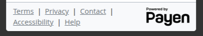
There are five placeholders in the footer for customisable links: Terms, Privacy, Contact, Accessibility, and Help.
- All links must use HTTPS.
- Providing all five links is not mandatory; only include the links that are required.
- Any links to be used should be listed in Appendix A.
Appendix A - Custom Styling Values Table
The following table should be completed and returned to your Integration Manager, along with any additional external resources, such as images. Download the Custom Styling Values Table (PDF, 135kB)
| Style | Section | Default value | Custom value |
|---|---|---|---|
| Light/Dark theme selection | Styling | On | e.g. Off, Dark |
| Language selection | Styling | On | |
| Primary buttons light | Styling | #0d6efd | |
| Primary buttons dark | Styling | #0d6efd | |
| Secondary buttons light | Styling | #6c757d | |
| Secondary buttons dark | Styling | #6c757d | |
| Main logo light | Merchant Logo | None | |
| Main logo dark | Merchant Logo | None | |
| Card entry screen | Card Entry Screens | App view | |
| Payment button label | Card Entry Screens | Pay | |
| Name on Card | Card Entry Screens | Off | |
| Success message | Transaction Success Screen | The card payment was successful. | |
| Loading spinner | Loading spinner | #0d6efd#6c757d | |
| Footer links | Footer links | Only configured links will be displayed. |